
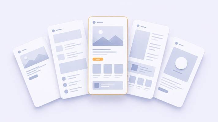
Most landing page advice is a list of ingredients: a headline, social proof, a strong call to action, some urgency. All true, all useless on its own — because the same ingredients arranged differently produce completely different results.
What actually decides the arrangement is two things: how warm the visitor is, and how expensive the decision is. Get those right and the layout follows.
Here are five patterns that work, who each is for, and how each one fails.
A note on numbers: you will see landing page articles quoting precise conversion lifts for specific tactics. Treat those with suspicion — they come from one company’s traffic, offer, and audience. What transfers between businesses is the mechanism, not the percentage. So this post explains mechanisms, and the only honest number for your page is the one you measure.
Pattern 1: The Single-Question Page
For: cold traffic, low-cost decision. Waitlists, lead magnets, newsletter signups, free trials, event registration.
Anatomy: one screen, or close to it. A specific headline, one sentence of clarification, one field, one button. No navigation menu. No footer links. Possibly one line of proof.
Why it works: the page has removed every decision except the one you want made. Navigation on a landing page is an exit; if a visitor arrives from an ad and clicks “About Us,” you have paid for a browsing session. Reducing the form to the minimum works for the same reason — every extra field is a small negotiation, and some people walk away from it.
How it fails: stripping the page so far that trust never gets established. Someone who has never heard of you needs a reason to believe the download is worth an email address. One credible line — a named client, a real number of users, a recognisable logo — usually costs nothing and does a lot. The other failure is a vague headline: “Transform your business” tells a cold visitor nothing about what they are signing up for.
Pattern 2: The Long-Form Objection Handler
For: warm or educated traffic, high-cost or high-commitment decisions. Courses, coaching, expensive software, services with a real price tag.
Anatomy: a long single-column scroll, structured as a sequence — problem, agitation, solution, how it works, proof, objections answered, pricing, FAQ, final call to action — with the same call to action repeated at several points down the page.
Why it works: length is not the mechanism; sequence is. An expensive decision is a chain of unanswered questions, and this layout answers them in the order they naturally arise. The repeated call to action matters because different readers reach conviction at different points — one is ready after the proof section, another needs the FAQ. Making them scroll back up to act loses some of them.
The FAQ section deserves specific attention. It is the highest-value block on this kind of page and is usually wasted on logistics. Use it for the real objections: why it costs what it costs, what happens if it does not work, why someone should choose this over the obvious alternative.
How it fails: length without sequence. A long page that repeats the same benefit in five different visual treatments does not build conviction, it builds fatigue. Also: running this pattern on cold traffic. Someone who arrived thirty seconds ago from an ad has no reason to read 2,000 words about you.
Pattern 3: The Comparison Page
For: visitors in active evaluation mode who already understand the category and are choosing between options — including yours versus doing nothing.
Anatomy: a short framing intro, then a structured side-by-side — pricing tiers, a feature comparison table, or an honest “us vs the alternatives” grid — followed by a recommendation and a call to action per column.
Why it works: it meets the visitor where they actually are. Someone comparing options is going to build this comparison whether you help or not — in a spreadsheet, in a browser with eleven tabs, or from a competitor’s version of this page which is not neutral. Doing it for them keeps them on your site during the decision.
The counterintuitive part: a comparison that admits where you are not the best choice tends to be more persuasive than one that wins every row. A grid where your column has every checkmark reads as marketing, and visitors discount all of it. Naming the customer you are wrong for makes every other claim more credible.
How it fails: too many columns. Four pricing tiers with overlapping feature sets produces choice paralysis, and the common outcome of paralysis is leaving, not buying. Three is usually the ceiling, with one visibly recommended. The other failure is comparing on dimensions nobody cares about — feature-count tables where half the rows are things no buyer has ever asked about.
Pattern 4: The Proof-Led Page
For: service businesses, agencies, consultants, B2B — anywhere the buyer’s main barrier is “can these people actually do it?” rather than “what is it?”
Anatomy: it inverts the usual order. A specific result opens the page instead of a value proposition — a named client and a concrete outcome, or a case study summary above the fold. Then the method, then more proof, then the call to action.
Why it works: for services, the product is trust, and everyone in the category makes identical claims. “We build websites that grow your business” is indistinguishable from every competitor. A specific, verifiable outcome is not copyable, and it does the work a generic value proposition cannot.
Specificity is the whole mechanism. “Increased their organic traffic” is a claim; a named company, a defined timeframe, and a real number is evidence. If confidentiality prevents naming clients, describe the situation precisely enough that a similar buyer recognises themselves in it.
How it fails: proof that does not match the visitor. An enterprise case study on a page aimed at small businesses actively hurts — the reader concludes you are not for them. If you serve distinct segments, they need distinct pages. Also fails when testimonials are generic praise: “Great to work with, highly recommend” is decoration, not evidence.
Pattern 5: The Demonstration Page
For: products where the value is visible but hard to describe — design tools, apps with a distinctive interface, anything where thirty seconds of watching beats three paragraphs of explaining.
Anatomy: visual-first. The product in use, above the fold — a short looping clip, an annotated screenshot sequence, or an interactive element the visitor can touch. Text supports the visuals rather than the other way round.
Why it works: it collapses the gap between interest and understanding. For some products, no amount of copy makes the value land, and a visitor who watches the thing work has effectively already tried it.
How it fails: weight. This is the pattern most likely to produce a slow page, and a demonstration that has not loaded is worth nothing. Autoplaying video with sound is a reliable way to make people leave. And a demo of an idealised workflow — perfect data, three items, no edge cases — can read as evasive to anyone who suspects real use is messier.
What all five share
Whatever pattern you choose:
One primary action. A landing page with three competing calls to action does not offer flexibility, it defers the decision. Secondary actions should look secondary.
Message match. The headline should closely echo the ad, email, or link that brought the visitor. A mismatch between what was promised and what appears creates an instant “wrong page” reaction, and it happens most often when one generic landing page serves several campaigns.
Clarity above the fold. Within a few seconds, a visitor should be able to answer: what is this, is it for me, what do I do next.
A deliberate mobile order. Most of this traffic is on a phone, where your carefully balanced desktop layout becomes a vertical queue. Decide the sequence for mobile specifically rather than accepting whatever stacking produces.
Speed. A landing page that loads slowly is a landing page some visitors never see. This matters more here than anywhere else on your site, because paid traffic means you are paying for every visitor who leaves before the page paints.
Choosing between them
A rough guide:
| Traffic | Low-cost decision | High-cost decision |
|---|---|---|
| Cold | Single-Question | Demonstration or Proof-Led |
| Warm | Single-Question or Comparison | Long-Form or Comparison |
And then test — but test the pattern, not the button colour. Comparing a long-form page against a single-question page for the same offer will teach you far more than any number of small variations within one layout.
At eThemeStudio, our landing page templates are built around these patterns rather than around a gallery of sections — each one structured for a specific traffic temperature and decision cost, and built light enough to survive paid traffic on mobile. Not sure which pattern fits your offer? Describe it to us and we will tell you which one we would start with.
Comments (0)